In recent years, Salesforce has set goals to reduce its net residual emissions to zero. In this effort, it has invested many of its resources into creating leading solutions in the fight against climate change. Our blog recently covered the main features of Salesforce Net Zero Cloud, formerly known as Sustainability Cloud. We were then fascinated with the dashboards that this cloud offers through the Net Zero Analytics application. Consequently, we decided to dedicate this article to those dashboards.
The Net Zero Analytics dashboards are useful in visualizing, in a user-friendly way, the status and trend of the main environmental indicators of your organization. This is achieved through the real-time analysis of multiple types of data. These dashboards will assist in creating an accurate picture of the Scope 1, 2, or 3 greenhouse gas emissions your company generates. With the disaggregated analysis of said impact, you will be able to develop a more efficient climate action plan that guides you towards the goal of zero emissions. To achieve this goal, you should not ignore these 7 predefined dashboards of Net Zero Cloud.
The 7 most important Dashboards of Net Zero Cloud
To access the predefined dashboards of Net Zero Cloud, you must enable CRM Analytics in your organization. From CRM Analytics Studio, you can then access the Dashboards tab of the Net Zero Analytics app. Within this tab, you will be able to find the list of dashboards. These will then serve as a basis for company executives to make better decisions regarding climate action plans:
1- Building Energy Intensity Dashboard
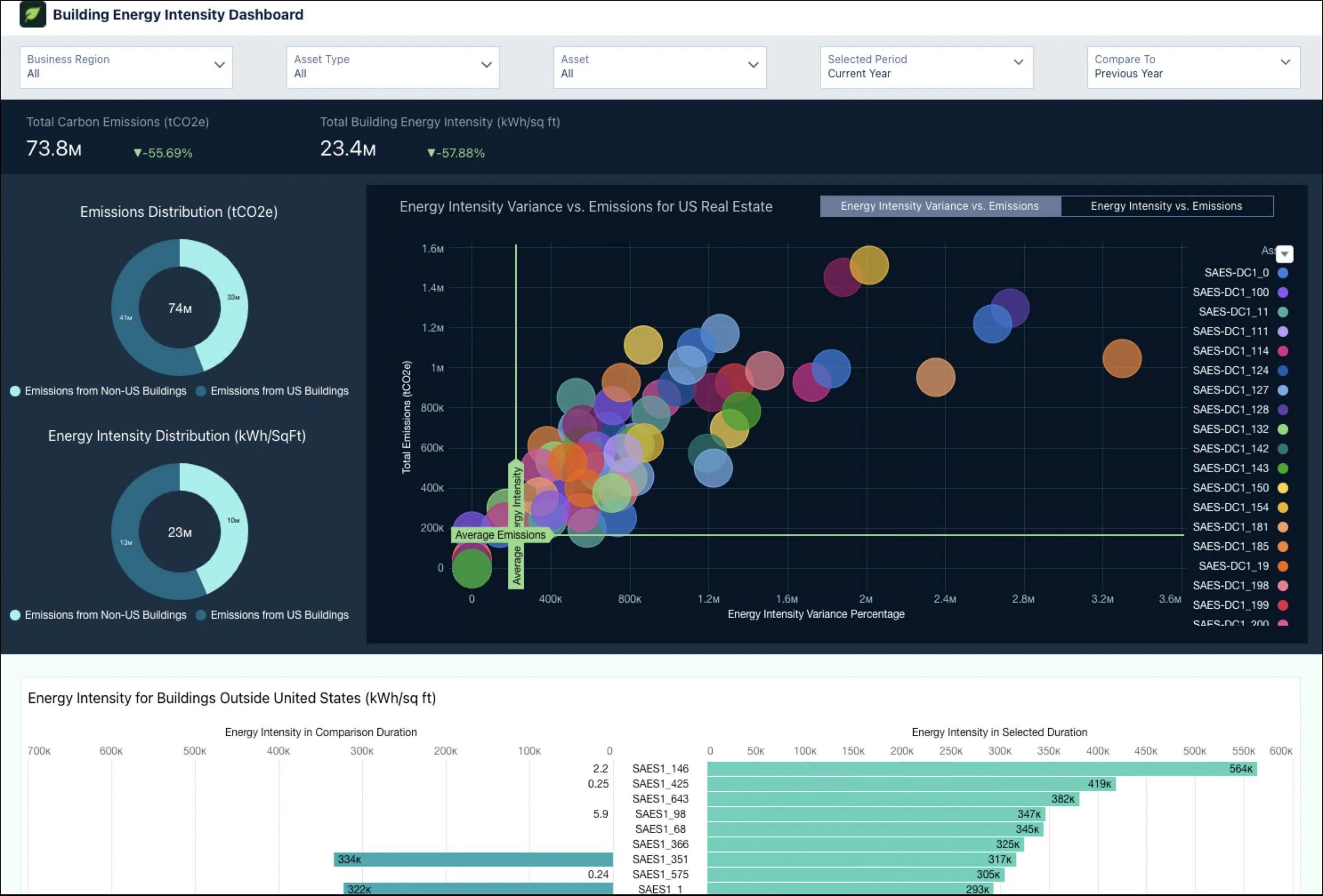
Compares the energy intensity of a Salesforce organization’s office buildings with similar ones in the US and abroad. The graphs regarding office buildings show aspects such as:
- Total carbon emissions and their variation.
- Total Energy Intensity and its variation.
- The Emissions and Energy Intensity for US buildings and Non-US buildings.
- The trend of emissions from the US real estate sector with respect to the Energy Intensity Variance.
2- Business Travel Impact Dashboard
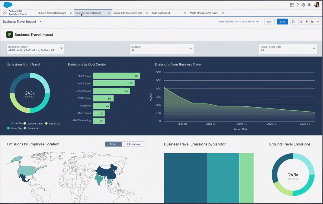
Shows the impact of business travel on an organization’s overall emissions. These trips can be both air and land, while also including hotel stays and car rentals. The graphs in this panel represent aspects such as:
- The contribution of business travel to overall emissions.
- The trend of business travel during a selected period.
- The region, supplier, and cost center with the highest emissions.
- The total emissions by travel type and expense type.
3- Scope 3 Procurement Dashboard
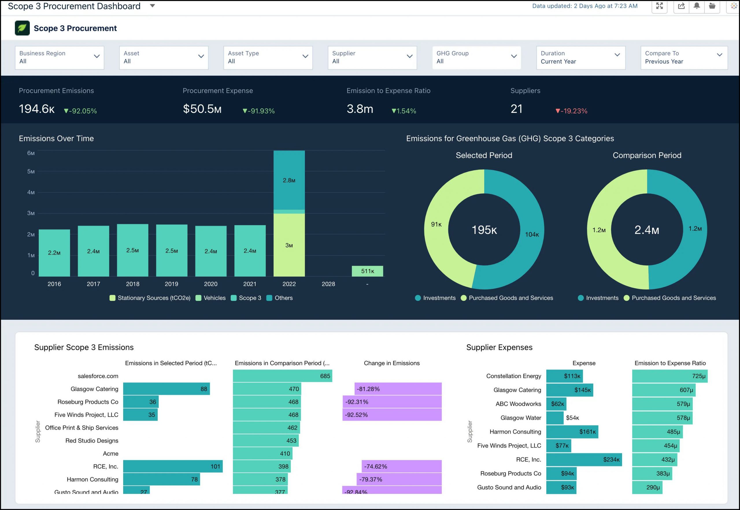
Shows the information obtained from the calculations of scope 3 emissions associated with the procurement. Through the graphs of this dashboard, you will be able to obtain:
- The behavior of emissions compared to a previous period.
- The emission-to-expense ratio for each supplier.
- The total emissions from procurement for each greenhouse gas scope 3 category (investments, purchased goods, and services).
- The changes in supplier emissions compared to a prior period.
4- Waste Management Dashboard
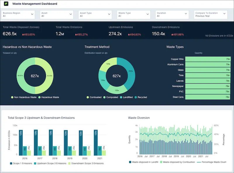
Offers information about the amount of carbon emissions associated with the organization’s waste. Thanks to the graphs of this dashboard, you would be able to know about:
- The percentage of hazardous and non-hazardous waste generated.
- The amount of waste that is combusted, composted, land filled, and recycled.
- The distribution of waste by type.
5- Water Management Dashboard
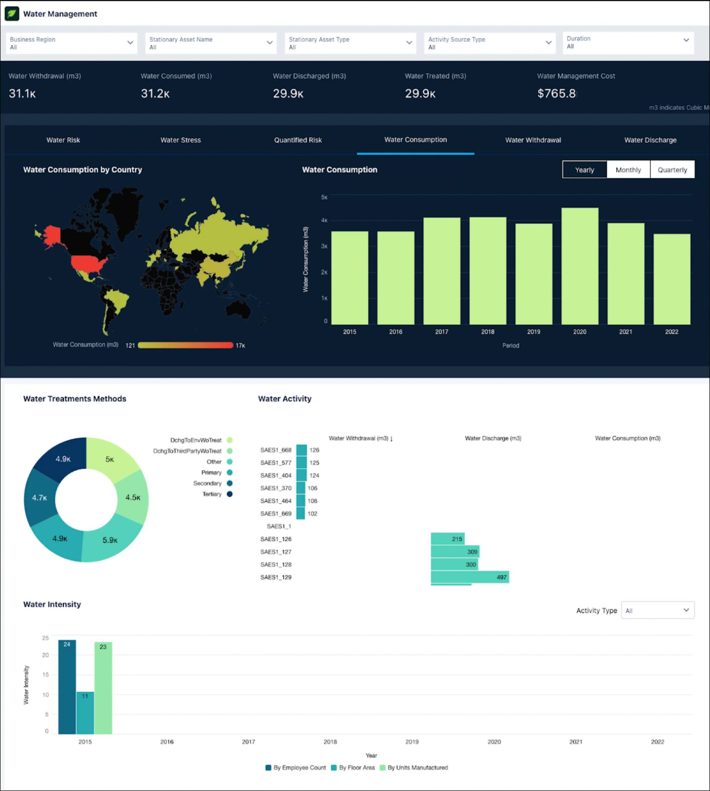
The information provided on this dashboard enables you to take effective steps to manage your water. The graphs in this case offer a summary of:
- The organization’s water consumption, withdrawal, and discharge over the years in both different regions and different assets.
- The intensity of water in different assets according to the number of employees and floor area.
- The organization’s water risk at different locations.
- The different water treatment methods used in the organization.
6- Climate Action Dashboard
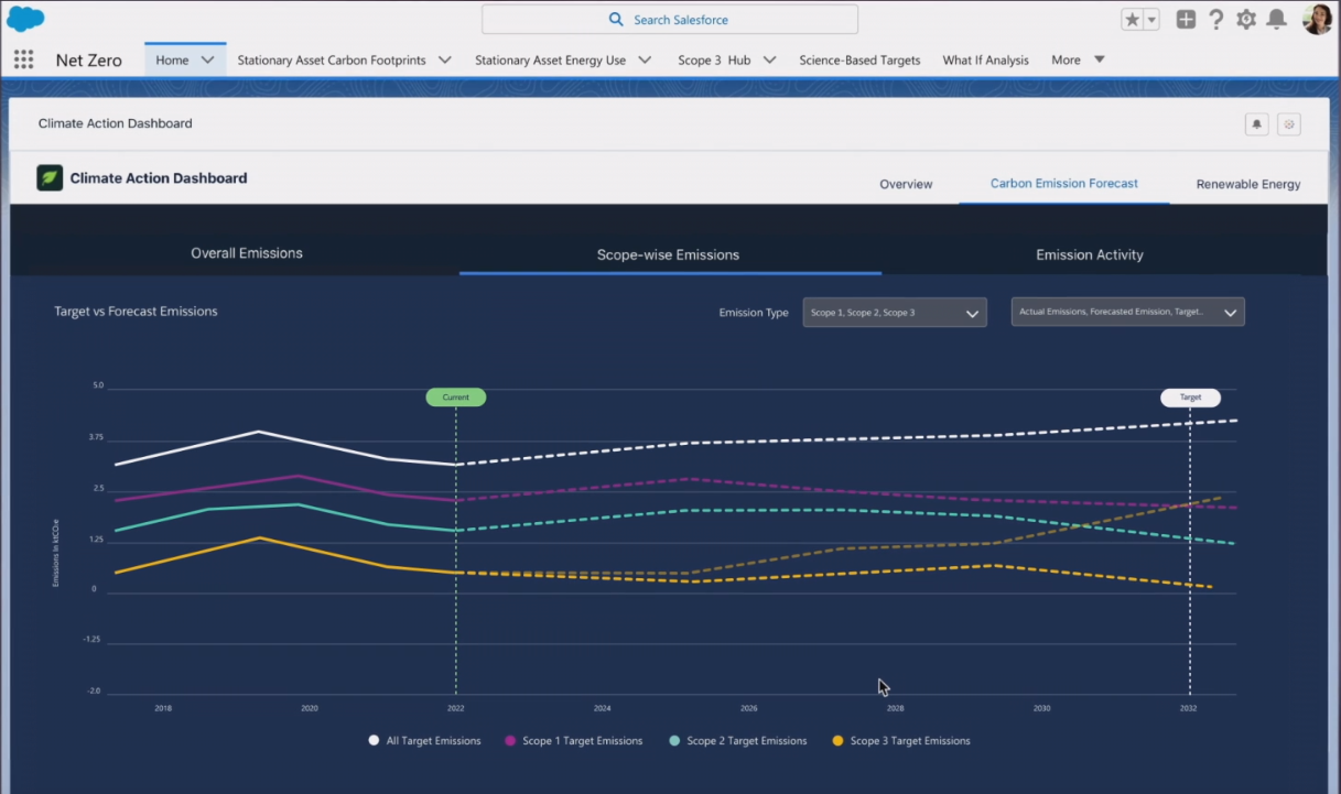
Provides data on the general state of emissions. The graphs in this panel break down the carbon footprint of the organization into aspects such as:
- The scope 1, 2, or 3 of your emissions.
- Market and location-based emissions trends, compared to prior periods.
- The main factors associated with your overall emissions.
- The total energy and electricity consumed by an organization’s buildings.
- Total emissions derived from electricity consumption by the city.
- The distribution of emissions by source and country.
7- Audit Dashboard
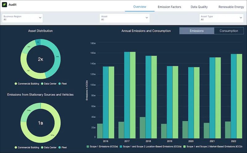
Shows a comprehensive view of all the elements that generally influence the measures taken by an organization in order to achieve net zero. Some of the components of this panel represent annual summaries of aspects such as:
- The total fuel consumed by the vehicles.
- The electricity consumed by the assets compared to other years.
- The energy consumed.
- The consumption of renewable energy.
Additionally, other graphics that are included express:
- The total number of emissions sources for each asset type.
- The total energy consumed by stationary sources in the reporting year.
- The monthly consumption of energy and the variation of electricity.
- Renewable energy consumption compared to total energy consumption.
Confronting climate change requires teamwork from society. Any investment in this objective is essential. Thanks to Net Zero Analytics, you can better understand and interpret your data and reinforce your climate actions. If you need a boost on your way to a sustainable future, do not hesitate to contact our experts through hello@theskyplanner.com.
